
In this guide, I have mentioned some working pointers that will improve your site’s mobile SEO and make your site mobile-friendly.
Almost all of us majorly depends on our smartphone nowadays. Right? It is the first thing that we can not wake up without. No doubt, smartphones have changed our lives. Similarly, it also changed SEO, i.e., mobile SEO.
Since Google started using mobile-friendliness as a ranking factor, it affected mobile searches in all languages worldwide. It also has a significant impact on Google’s mobile search results.
Google is advising all webmasters to ensure their websites are mobile-friendly. And as their algorithms are updating day by day, it’s essential to have a complete idea about the Mobile SEO.
What is Mobile SEO?
Mobile SEO is far different as compared to the more standard SEO practices. It describes the activity of doing search engine SEO optimization to increase your website’s visibility in mobile searches.

For webmasters, it is based on very similar principles to general SEO. It helps you get in the right place at the right time and makes sure the experience you offer consumers is stellar.
Since Google started the mobile-first index, it determines site rankings based on the quality of the mobile version of the site. Indirectly, this is short notice by Google to webmasters that even if they are not considering their mobile site, they will still get judged. Thus, it is time to take action.
Now, all you need to do, make sure that your site is crawlable and findable. Just like regular SEO, you need to know how your site is currently performing and what your visitors are doing now.
Nobody knows precisely how this process is different from the current one. Still, you must keep your mobile site crawlable by taking down all possible barriers like poorly loading scripts.
Naah, you don’t need to block anything in your robot.txt file. Instead, you have to focus on some points like site performance, contents, and UX. Additionally, you have to become a good friend with Google Search Console. Its search tools will help you find out how your site is doing in the search results. For example, you can even see how mobile and desktop users use words to find what they need.
It also allows you to check your site’s posts and pages that don’t follow Google’s mobile-friendly rules via its Mobile Usability tools. I think this is an excellent way to start improving your mobile SEO.
The next thing you have to is checking site performance. Although, while working on mobile SEO, it is one of the essential factors. The faster your site is, the happier your users will be.
Optimizing performance, however, is an incredibly tricky task. There are lots of things to do to make your site fast. To improve, keep a close watch on-site performance on mobile.
PageSpeed Insights:
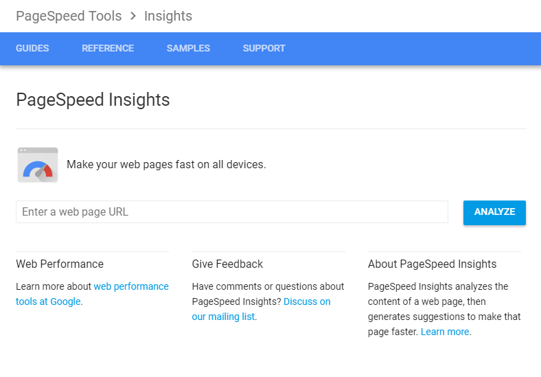
Google PageSpeed Insights will help you in this case. The tool checks your site performance based on Desktop view and mobile view as well.
Put in your URL, and Insights will give you two scores: one for mobile and one for the desktop.
It also suggests performance improvement enhancements. Follow these suggestions, and you’ll be on your way.
Make Sure You have a responsive design:
Google prefers responsive design. It will also benefit you by making your site eligible for an addition to the new mobile-first index.
To make it mobile proof, you just need to add the meta name=“viewport” declaration in the head of your documents.
<meta name="viewport" content="width=device-width, initial-scale=1.0">You can also use a plugin to design mobile design.
Focus on User Experience:
Along with the site speed, your site should deliver a better user experience. There’s a lot you need to consider when optimizing your user experience. They are as follows:
- Font size
- Enough space for clickable elements
- Buttons size: they should be large enough
- Clickable menu and links as well
Implement AMP:
AMP is an abbreviation of Accelerated Mobile Pages that serve optimized pages of your website to your visitors. It taps into open-sourced technical components that promote speed and ease of use for online content readers.
WordPress made it easy to make your site AMP ready by providing AMP plugins in the plugin directory. Install the plugin and activate it.
Benefits of using AMP:
- It fastens your page. Thus it will give you a higher rank.
- Reduce the bounce rate by enabling your readers to stay on the page for a long time.
Get ready for voice search:
Technology is moving fast now. Most of the people now search by using voice to perform actions on the page. It means another task for you to do is working on Voice search. So while working on your content, also focus on several things:
So while working on your content, also focus on several things. For example, finding out which questions people use to find your content. To do so, ask yourself, does it answer any question a user might have?
If it is not satisfying, change it.
Use Structured data in mobile site:
Structured data referred to as a system of pairing a name with a value that helps search engines categorize and index your content. It allows you to open a line of communication with search engines.
Using schema on the mobile site, your site immediately stands out from the crowd and thus secure good rankings.
Wrapping words:
In this guide, I have mentioned a lot of working pointers that will improve your site’s mobile SEO. It’s all depends on your focus and hard work. As technology is changing, you also have to keep up.
Get your smartphone, check your site in a mobile browser, and find and fix those issues. Comment what issues you got and What you did to improve your mobile SEO. Do not forget to check a list of most important ranking factors.
